- calendar_month September 27, 2021
We spend a lot of time choosing how we want our homes to look and selecting items that we think will look nice, but many decor mistakes happen in the process of putting the pieces together. Home decor mistakes are all too common; we see them time and time again, even in otherwise beautiful homes. We put together this list of the top 7 home decor mistakes to help you avoid these design pitfalls.
Mistake #1: Overstuffing a room
Photo by Apartment Therapy
One of the biggest mistakes people make is overdoing it with their decor, making the room feel stuffed or cluttered. There are too many distractions in a cluttered room or house. Not only are there are different items scattered all over the place, which makes it difficult to find anything, but it's also distracting to the eye and creates a chaotic and overwhelming environment. Clutter can even reduce productivity. Avoid this by reducing the number of things you have but don't need, and use cabinets and bins to hide away items that don't need to be out. Not sure how to begin? Try the KonMari method.
Mistake #2: Trying to incorporate multiple trends at once
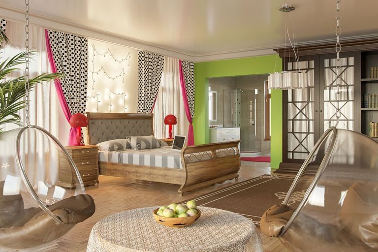
Photo by Home Beautiful
Trends will come and go, but you should never try to be trendy. Instead, try to focus on what works for your home and make sure that you are not incorporating a trend if it does not fit in with your identity. When you try to achieve too many trends, you end up neglecting your personal style and any details that make your home feel like "you." Don't sacrifice personalization for what you saw as the newest trend if it doesn't feel cohesive with your style.
Mistake #3: Lack of Planning or Organization
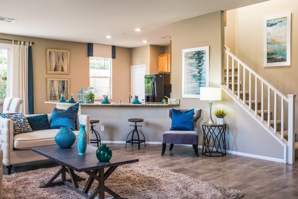
Photo by Neonbrand via Unsplash
Organizing your home doesn't have to be a time-consuming task that requires a lot of planning. You simply need to pay attention to the main flow of each room and how to keep things "open." Sit in every chair in the room. Imagine guests sitting in the other spots of the room. Does your chair feel a little too far away from the other chairs? Do any of the chairs appear to be floating in the middle of the room? Does your armchair or sofa block a natural walking path, making people divert their direction to go around it? Do all tables have a purpose? Are corners or walls left empty? These are questions you can ask yourself when rearranging your furniture. Try to view a room from every perspective, and make sure it's logically laid out.
Mistake #4: Choosing pieces that are too big or too small
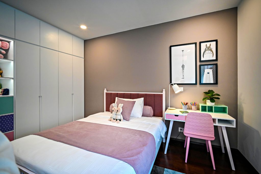
Photo by Huy Nuyen via Unsplash
The two biggest culprits of this mistake are rugs that are too small and beds that are too big. Does your bed overwhelm the room and make it awkward to walk around? Downsize, or try moving the bed to face a different direction. Does the rug in your room seem to be floating by itself and surrounded by the furniture? You need a bigger rug. Before you buy any furniture or decor pieces, ALWAYS measure the room!
Mistake #5: Neglecting the entry
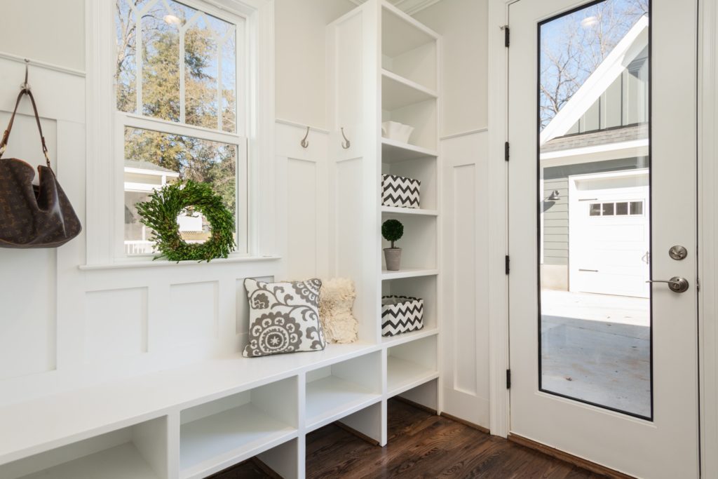
Photo by Douglas Sheppard on Unsplash
First impressions are important, right? The first impression someone will make of your home is when they walk in the door. What do they see in your home's foyer? Make sure the space is not neglected. Create an inviting area that has a nice flow into the rest of the home. It should give a taste of what's to be expected in the rest of the house. Don't just leave it a plain, boring area where people drop their keys and kick off their shoes.
Mistake #6: Incorrectly hanging your drapes
Photo by David Sjunnesson on Unsplash
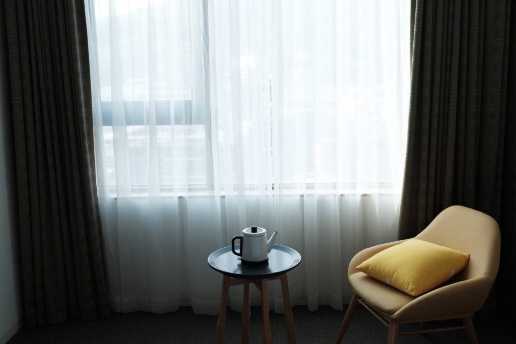
Have you ever seen curtains that just seem... odd? They look low quality or misplaced. This could be because the curtains are the wrong length. How do you know how your curtains should be hanging? The curtain rod should be just below the ceiling (and approximately 4 to 6 inches above the window frame). The curtains, when hanging, should just barely skim the floor. Any longer and they'll look sloppy; any shorter and they'll look awkward.
Mistake #7: Having a boring kitchen
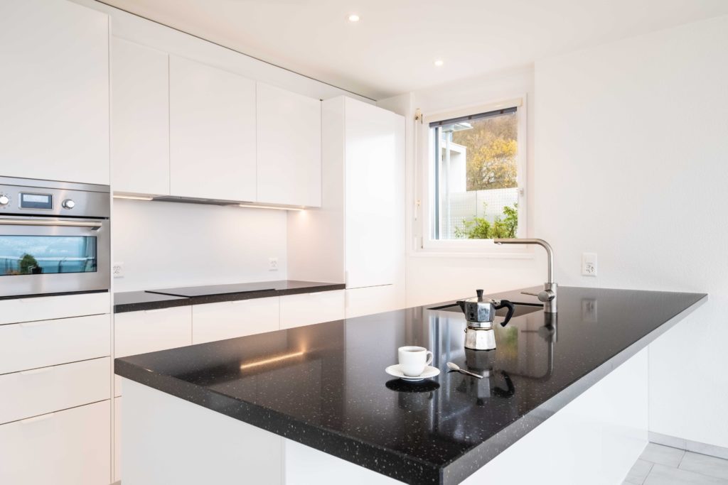
Photo by immo RENOVATION on Unsplash
A kitchen needs to be practical, but don't stop there. Many people will simply make sure their kitchen works and covers their cooking needs, but they won't do anything beyond that, leaving the kitchen lifeless and dull. A kitchen is sometimes an unrecognized common area. People like to hang out together while making a meal. Therefore, bring some warmth to this space by adding a pop of color. Add some flowers in a vase on the counter, hang cute curtains on the window above the sink, or display your beautiful serving dishes by hanging them on the wall or neatly stacking them. Make your kitchen feel like the happy, inviting place that it is.
We hope these suggestions help provide you with ways to avoid the common mistakes people make with their home décor. Will you make any design changes to your house after reading this? What are other mistakes you've seen people make? Let me know.

